Discovering the Art of Giorgio Morandi
Giorgio Morandi
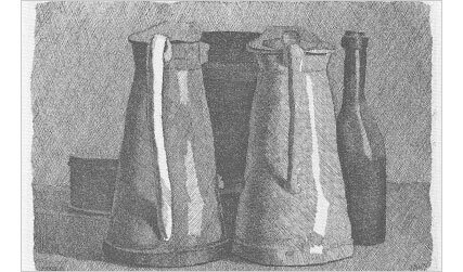
This etching is by Giorgio Morandi, one of my favorite artists. As you can see, his style of drawing rounded shapes is not consistent with an analytical drawing. This dichotomy illustrates an issue pertinent to every example I use from the history of fine art, which is that the examples I give will expand the ideas of the lesson, rather than simply reinforcing the lesson.
For instance, I have demonstrated how to use curved lines in drawing using eclipses to obtain a form of roundness and because the subtlety of making those lines is a way for you to engage the sensuousness of your reflexes. And now I show you a Morandi still life where he uses straight lines to describe round forms. How confusing! The Morandi etching depends for much of its contemplative beauty on the game the artist plays between the implied depth in which the objects exist and the texture of the lines that bring the drawing back to the surface.
When you are learning to draw, it is useful to understand the most obvious methods of achieving form and proportion, but when your idea of what you want to do in your drawing is strong enough, any line, texture or implement can achieve your vision.
At this point in the lesson this is a good lead into observing the art of Giorgio Morandi being that we are observing the shapes of things and their delicate balance within a drawing.
Who was Giorgio Morandi?
Giorgio Morandi, (born July 20, 1890, Bologna, Italy—died June 18, 1964, Bologna), Italian painter and printmaker known for his simple, contemplative still lifes of bottles, jars, and boxes.
Morandi developed an intimate approach to art that, directed by a highly refined formal sensibility, gave his quiet landscapes and disarmingly simple still-life compositions a delicacy of tone and extraordinary subtlety of design. His gentle, lyrical colours are subdued and limited to clay-toned whites, drab greens, and umber browns, with occasional highlights of terra-cotta. Morandi’s paintings of bottles and jars convey a mood of contemplative repose reminiscent of the work of Piero della Francesca, an Italian Renaissance artist whom he admired.
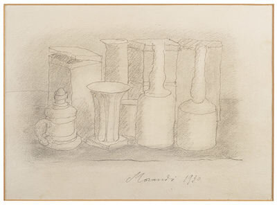
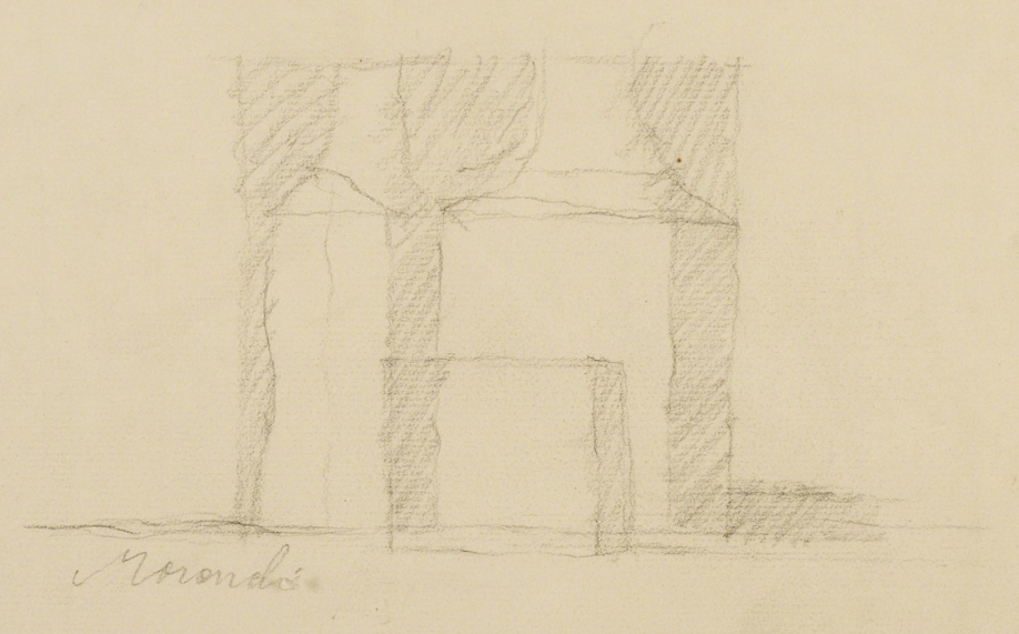
In these three works by Morandi notice how each object relates to each other. There is a simplicity of beauty when the shapes of each object are in relation the the object next to it. It is a bit like playing chess. In chess all the pieces on the board are positioned for a win at a certain point. In drawing all the shapes of objects contain an outer line or dimension that acts like a flowing piece of music. One line softly leads into another. What occurs is that the objects are strategically placed either directly beside each other or overlapping from the front or back. This gives depth to a scene, movement, drama, and rhythm, to a composition. Notice that the three objects above could be anything from bottles and squares to buildings in a distance. It is the arrangement of the composition that determines the visual music to occur, just like arrangements of notes compose a great piece of music and tone.
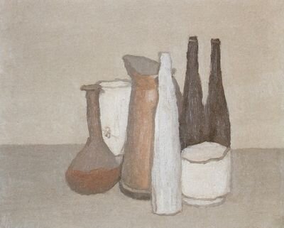
Let’s now observe how Morandi uses color. We see that he is concerned with the beauty of simplicity of line, shape and form. His lines are like whispering, they are visible and invisible. In the painting below notice the colors he has chosen They are subtle, dusty, soft. They match the lines he has created. Notice the dominate color, that of the orange or red in the off center of the painting. If it were placed anywhere else it would make the painting unbalanced. This painting could just as easily be a family portrait with the Mother representing the pitcher and her children being the four glasses in front. There is an emotional tone that is sought.
In the four objects above notice how they are all different in shapes and color. There is a forth object in the back of a row of three containers. It only takes that one shape in the back to give the other three objects depth. The objects themselves each have a softness and simple representation with wavy lines and subtle dark contour lines of definition.


